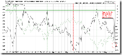
Some readers may not be familiar with the breadth charts (denoted by 2.x.x) in my Stockcharts public chartbook. Here is a brief introduction.
All breadth charts use the follow convention consistently:
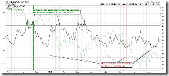
Black line at the foreground denotes the signal itself, while the pale green line at the background denotes the market. Usually red horizontal line means the green line will likely reverse and go down once the black line reaches this level, green horizontal line means green line will likely reverse and go up once the black line reaches here. In this way, you don't really need to know much about the technical detail of the breadth chart, and just pay attention to how far away the black line is from the green/red horizontal lines. The pale green line at the background is for the reference and to convince you that the relative position of the black line between red and green lines does influence the market (pale green line at the background).
Take 2.0.2 Volatility Index 30-day/90-day Ratio for example. For your convenience, I put a few red and green vertical dashed lines on the chart. Note that every time the black line touches the green line, the pale green line (denotes the market) at the background at the position of green vertical dashed line is usually at the bottom. So is the case for the black line touch touching the red line. Now take a look at the position of the black line, is it fairly close to the red horizontal line which marks the market top? It means the market is approaching the top, doesn't it?
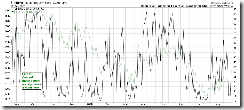
After reading the above explanation, take a look at 3.2.4 Yen RSI and the Market Bottom, you got it, right?
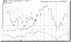
2.3.0 NYSE High-Low Index follows the same convention.


