Conclusion:
- I think we are in confirmed intermediate term down trend. Breaking of support on Thursday was the confirmation. Big moneys takes time to move and adjust their positions. So a broken chart has a very low probability of being recovered in the near term.
- The market may likely bounce back. Although there is no evidence on the intraday charts of major indices, NYSE High-Low Index is extremely overbought, in addition with the help of treasury news I believe the market will possibly bounce back.
Evidence of short term bounce:
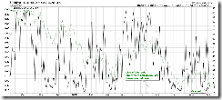
2.3.0 NYSE High-Low Index, oversold. The probability of market rebound, which is denoted by the green line at the background, is very high while the black line reaches the green horizontal line.
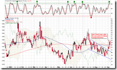
2.0.0 Volatility Index - NYSE (Daily), Bearish Dark Cloud Cover and the resistance on STO, so I think VIX should drop down which means the market may bounce back.
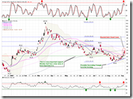
3.2.0 Japanese Yen (Daily). Japanese Yen is also Bearish Dark Cloud Cover pattern. STO and RSI support the pullback of Yen, which in turn means the market might rise.
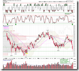
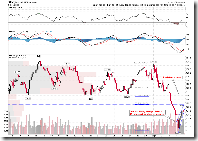
1.1.6 PowerShares QQQ Trust (QQQQ Daily). QQQQ is extremely oversold and STO is right on the support. Volume looks like a typical capitulation pattern. The big chance is QQQQ will go up.
1.0.3 S&P 500 SPDRs (SPY 60 min). The target of rebound is at Fib 50, which is the key support broken on Thursday and now turns into resistance. Because of the rescue of Treasury, it is extremely like the market opens at Fib 50. Never forget the possibility of fade gap. I don't believe such a news is sufficient for breaking the resistance above Fib 50, the reason is: Buy on Rumor Sell on News.
5.3.0 Financials Select Sector SPDR (XLF Daily). After reading the chart you will know why the Financials is strong recently is related with this rumor. Now the rumor got confirmed, will Sell on News happen? I guess that, the majority of fund is still riding the fence, and thus the money to push up the market is limited. Due to the sector rotation, what those limited money can do is flowing back and forth across different sector. When the money is pressing down this sector, it will be pushing up another sector at the same time. Afterward it may sharply make a U-turn to do the opposite.
5.0.2 S&P Sector Bullish Percent Index. On this chart you should be able to tell the sector rotation. But the issue is that, the energy sector has been very close to the historical low. I am not saying the sector rotation must happen this time, or the money will flow into the energy sector due to the rotation. However, the energy sector does look attractive, doesn't it? You may carry out further investigation and see if the Bullish Percent Index of the energy sector is the closest to the historical low among the all sectors?
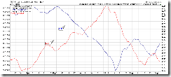
The following chart precisely shows the anti-correlation between the energy sector and the financial sector.
So my conclusion is that, soon the Financials Sector will likely be sold on news and the Energy Sector will bounce back because of the rebound of US dollar and the crude oil.
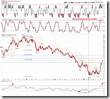
Let's take a look at US dollar. 3.1.1 US Dollar Index (Weekly) retraced exactly to Fib 38.2, the location at where the rebound is likely finished. Furthermore, RSI14 at the bottom is very close to the overbought level. Don't forget our new weapon -- drum please -- STO is a sell signal already.
Evidences for the intermediate term down trend have been listed many times in the past. Now let's put them together just for clarification. What I really mean is that the probability of that all signals are wrong this time is quite low.
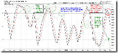
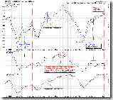
0.0.5 Weekly STO and the Market Top/Bottom. Hopefully you have no different opinion to this signal based on Weekly STO5. Now I have officially added it to 0.0.0 Signal Watch and Daily Highlights. During the past, is there any time the market stopped dropping while STO was still above 20? No. Therefore, I believe the last Friday low will not be likely the bottom even if the market rises significantly in the next week.
1.0.6 S&P 500 Bullish Percent Index. Note the blue boxes on the chart. If any individual index gives a sell/buy signal, probably it is a whipsaw. If all three indices give the same signal at the same time, so far it never gets wrong. So we have a confirmed sell signal, right?
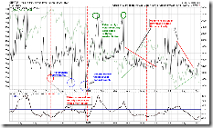
2.3.3 NYSE Total Volume. The normalized total volume denoted by the black line at the bottom has reached a new low. I just don't believe the market could bottom at this place.
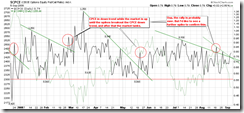
2.8.0 CBOE Options Equity Put/Call Ratio. Now it seems this chart gave the earliest signal to point out the rebound was over. Unfortunately the signal was overlooked.
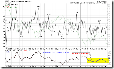
2.8.1 CBOE Options Total Put/Call Ratio. Similar with 2.3.3, the normalized CPC ratio at the bottom is over bullish, and I am not convinced that the market was bottomed here.
The T2123 chart in Telechart is obtained by accumulating the difference between the value of 4-week-high and 4-week-low everyday, which is used to inspect the intrinsic strength of the market. T2123 is one of my key intermediate term signal, which is equally important as NYSI. Take a look how the blue line (denotes the market) acts while how the green line crosses below the brown line. Now we just got a sell signal, and there are few whipsaws on the chart.
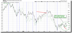
The only indicator which has not confirmed the mid-term sell signal is 2.2.0 NYSE McClellan Chart. Why? Take a look at 2.4.0 NYSE Advance-Decline Issues (Daily), the green line denotes the market has broken out and been going down, but the black line denotes NYAD is still quite high. This is a positive divergence and it directly causes 2.2.0 is still buy signal so far. This divergence might be because the financial sector has been strong recently, and this sector has the heaviest weight in NYSE. The only hope of bulls is whether the market will be pushed higher with the help of strong financial sector. We will see in the next week.


6 Comments