In this weekend I reorganized the technical indicators in my chart-book and arranged the important ones on chart series numbered with 0.x.x. If you are too busy to go through all the charts, just check out 0.x.x.
Conclusion:
- Over the intermediate term the market should have a decent upside room.
- It is unclear if the market goes up or down on Monday. However we may see a pullback in the near term.
Mid-term signals:
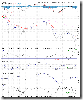
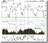
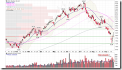
0.0.3 SPY Mid-term Trading Signals. There are two mid-term buy signals, where one of them BPSPX is confirmed and I will show you. It is also encouraging that VIX:VXN is still in the buy zone, which means the market should have a decent upside room in the mid-term.
1.0.6 S&P 500 Bullish Percent Index. All three major indices have confirmed the buy signal. On this chart, once all three indices agree with each other, the success rate is very high.
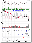
2.3.3 NYSE Total Volume. The market bottom pattern is quite convincing.
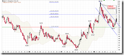
3.2.1 Japanese Yen (Weekly). Black candle and Fib 50, very likely it will pull back, and this is bullish to the stock market.
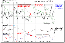
1.4.4 TSE McClellan Oscillator. Canadian market also gives a buy signal. According to the golden candles, it seems the market has bottomed out.
Short-term signals:
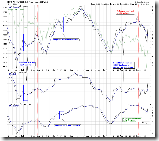
0.0.2 SPY Short-term Trading Signals. The breadth indicators are at relatively extreme range. So we may see a pullback soon or later.
2.8.0 CBOE Options Equity Put/Call Ratio. This is over bullish and isn't sustainable.
1.0.3 S&P 500 SPDRs (SPY 60 min), 1.1.4 PowerShares QQQ Trust (QQQQ 60 min), 1.2.3 Diamonds (DIA 60 min). Note the resistance. RSI is close to the resistance, too.
A few interesting charts:
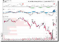
3.4.1 United States Oil Fund, LP (USO Daily). It rallied for three days with a decrease of the volume. This pattern is quite bearish.
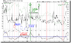
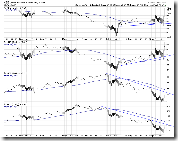
The following chart is very interesting. Take a look at two industrial groups which are highest above 50-day moving average and lowest below it, respectively. Note that the problematic banks and home builders did not go under along with the recent selling-off. On the contrary, the resource group dropped a lot. What kind of information does this chart give us? It is still a open question, and your comments and discussion are appreciated.

4 Comments