Vertical red or green lines
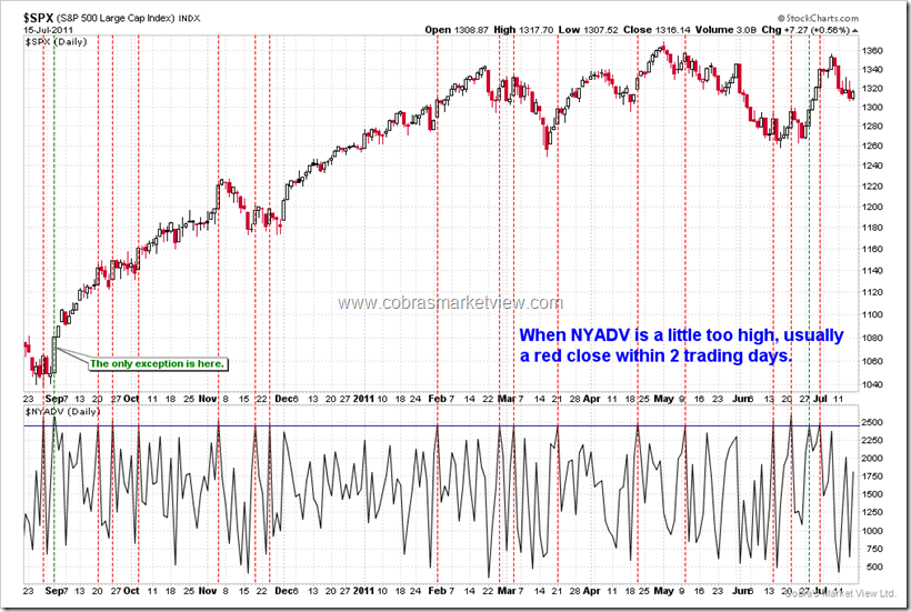
As I mentioned above, Technical Analysis is mostly about history, so I always like to show you what happened the next when certain condition was met. To make it easy to see what happened the next, I usually mark the bar that triggers the condition with a vertical dashed line. I use red to mean what happened the next is bearish while green to mean bullish and blue to mean what about to happen is not yet known.
Negative or Positive Divergence
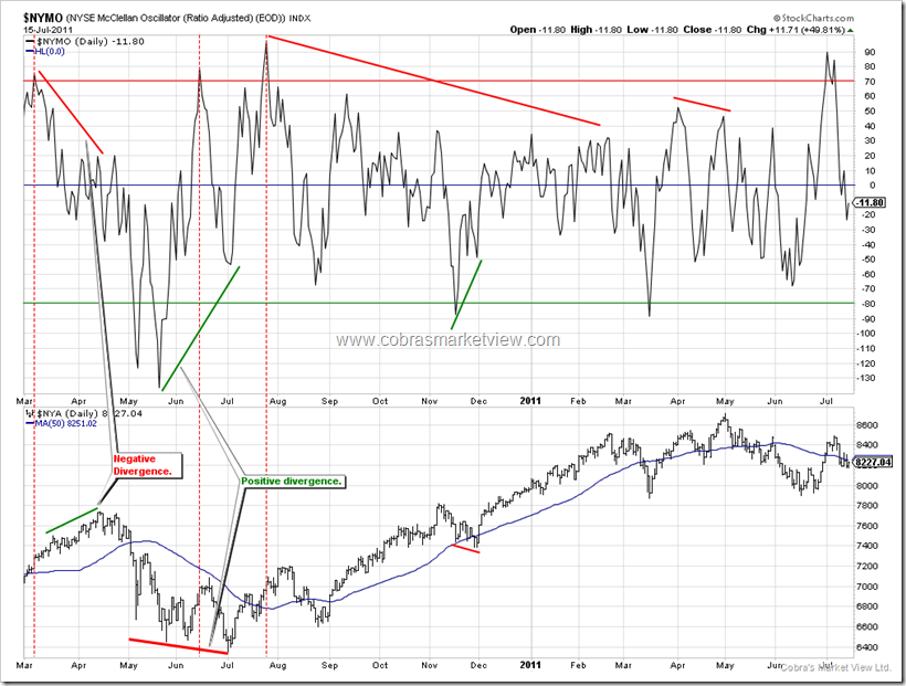
Price and indicator are supposed to move in-sync. When they are not moving in the same direction, it’s called divergence. When price is down while indicator is up, it’s called positive divergence, while price is up indicator is down, is called negative divergence. I like to use green line on bottom of the indicator to show positive divergence and red line on top of the indicator to show negative divergence. In order for you to easily understand the concept of divergence, I put the green/red lines also on the price itself but usually I only draw lines on indicator itself while skip lines on the price.
Back Test or Statistics
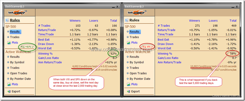
At the very first glance, Back Test might appear objective, but in fact, it’s rather subjective in nature because things keep changing, what was true 100 years ago may not be true in the recent 10 years, so choose different back test period may get totally different results. See example below, when both VIX and SPX are down on the same day, testing the past 5,000 trading days doesn’t get much bullish edge for the next day as that of testing the past 2,000 trading days. So my general solution for this is, since the most recent occurrences should always weights more, to use a fixed back test period, say, always use the last 2,000 trading bars (either daily bar or weekly bar).


